1. Try respect aspect when only 1 media 2. Distance-based image inner-scroll animation 3. Small inner radius between media when >=2 media |
||
|---|---|---|
| .github | ||
| compose | ||
| design | ||
| public | ||
| readme-assets | ||
| scripts | ||
| src | ||
| .env | ||
| .env.production | ||
| .gitignore | ||
| .prettierrc | ||
| index.html | ||
| LICENSE | ||
| package-lock.json | ||
| package.json | ||
| PRIVACY.MD | ||
| README.md | ||
| rollbar.js | ||
| vite.config.js | ||
🗣️ Pronunciation: /fænpi/ (FAN-pee) 🔊 Listen
This is an alternative web client for Mastodon.
- 🏢 Production: https://phanpy.social
productionbranch- break less often
- slower fixes unless critical
- 🏗️ Development: https://dev.phanpy.social
mainbranch- may see new cool stuff sooner
- may break more often
- may be fixed much faster too
🐘 Follow @phanpy on Mastodon for updates ✨
Everything is designed and engineered following my taste and vision. This is a personal side project for me to learn about Mastodon and experiment with new UI/UX ideas.
Features
- 👪 Multiple accounts
- 🪟 Compose window pop-out/in
- 🌗 Light/dark/auto theme
- 🔔 Grouped notifications
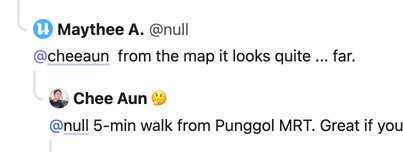
- 🪺 Nested comments thread
- 📬 Unsent draft recovery
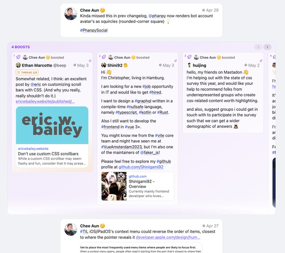
- 🎠 Boosts Carousel™️
- ⚡ Shortcuts™️ with view modes like multi-column or tab bar
- #️⃣ Multi-hashtag timeline
Design decisions
- Status actions (reply, boost, favourite, bookmark, etc) are hidden by default.
They only appear in individual status page. This is to reduce clutter and distraction. It may result in lower engagement, but we're not chasing numbers here. - Boost is represented with the rocket icon.
The green double arrow icon (retweet for Twitter) doesn't look right for the term "boost". Green rocket looks weird, so I use purple. - Short usernames (
@username) are displayed in timelines, instead of the full account username (@username@instance).
Despite the guideline mentioned that "Decentralization must be transparent to the user", I don't think we should shove it to the face every single time. There are also some screen-reader-related accessibility concerns with the full username, though this web app is unfortunately not accessible yet. - No autoplay for video/GIF/whatever in timeline.
The timeline is already a huge mess with lots of people, brands, news and media trying to grab your attention. Let's not make it worse. (Current exception now would be animated emojis.) - Hash-based URLs.
This web app is not meant to be a full-fledged replacement to Mastodon's existing front-end. There's no SEO, database, serverless or any long-running servers. I could be wrong one day.
Subtle UI implementations
User name display
- On the timeline, the user name is displayed as
[NAME] @[username]. - For the
@[username], always exclude the instance domain name. - If the
[NAME]looks the same as the@[username], then the@[username]is excluded as well.
Boosts Carousel
- From the fetched posts (e.g. 20 posts per fetch), if number of boosts are more than quarter of total posts or more than 3 consecutive boosts, boosts carousel UI will be triggered.
- If number of boosts are more than 3 quarters of total posts, boosts carousel UI will be slotted at the end of total posts fetched (per "page").
- Else, boosts carousel UI will be slotted in between the posts.
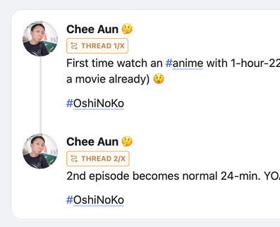
Thread number badge (e.g. Thread 1/X)
- Check every post for
inReplyToIdfrom cache or additional API requests, until the root post is found. - If root post is found, badge will show the index number of the post in the thread.
- Limit up to 3 API requests as the root post may be very old or the thread is super long.
- If index number couldn't be found, badge will fallback to showing
Threadwithout the number.
Filtered posts
- "Hide completely"-filtered posts will be hidden, with no UI to reveal it.
- "Hide with a warning"-filtered posts will be partially hidden, showing the filter name and author name.
- Content can be partially revealed by hovering over the post, with tooltip showing the post text.
- Clicking it will open the Post page.
- Long-pressing or right-clicking it will "peek" the post with a bottom sheet UI.
- On boosts carousel, they are not partially hidden, but sorted to the end of the carousel.
Development
Prerequisites: Node.js 18+
npm install- Install dependenciesnpm run dev- Start development servernpm run build- Build for productionnpm run preview- Preview the production buildnpm run fetch-instances- Fetch instances list from instances.social, save it tosrc/data/instances.json- requires
.env.devfile withINSTANCES_SOCIAL_SECRET_TOKENvariable set
- requires
npm run sourcemap- Runsource-map-exploreron the production build
Self-hosting
This is a pure static web app. You can host it anywhere you want. Build it by running npm run build and serve the dist folder.
Try search for "how to self-host static sites" as there are many ways to do it.
Tech stack
- Vite - Build tool
- Preact - UI library
- Valtio - State management
- React Router - Routing
- masto.js - Mastodon API client
- Iconify - Icon library
- Vanilla CSS - Yes, I'm old school.
Some of these may change in the future. The front-end world is ever-changing.
Mascot
Phanpy is a Ground-type Pokémon.
Maintainers
Backstory
I am one of the earliest users of Twitter. Twitter was launched on 15 July 2006. I joined on December 2006 and my first tweet was posted on 18 December 2006.
I know how early Twitter looks like. It was fun.
Back then, I made a Twitter clone called "Twig" written in Python and Google App Engine. I almost made my own Twitter desktop client written in Appcelerator Titanium. I gave one of my best talks about the Twitter client in a mini-conference. I built this thing called "Twitter Columns", a web app that shows your list of followings, your followings' followings, your followers, your followers' followers and so on. In 2009, I wrote a blog post titled "How I got started with Twitter". I created two themes for DestroyTwitter (a desktop client made with Adobe Air by Jonnie Hallman) and one of them is called "Vimeo". In 2013, I wrote my own tweets backup site with a front-end to view my tweets and a CouchDB backend to store them.
It's been more than 15 years.
And here I am. Building a Mastodon web client.
Alternative web clients
- Pinafore (retired) → Semaphore
- Cuckoo+
- Sengi
- Soapbox
- Elk
- Mastodeck
- Trunks
- Tooty
- Litterbox
- Statuzer
- More...
💁♂️ Notice to all other social media client developers
Please, please copy the UI ideas and experiments from this app. I think some of them are pretty good and it would be great if more apps have them.
If you're not a developer, please tell your favourite social media client developers about this app and ask them to copy the UI ideas and experiments.
License
MIT.


